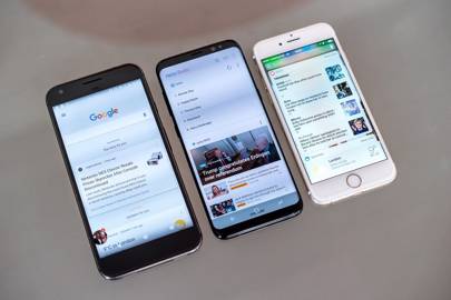
With the Galaxy S8, Samsung has made an Android phone more desirable than an iPhone. For all its faults, for all the ways Samsung could spend less time and money on gimmicks and more on on-going software support, for all the cheaper options out there, there’s no other phone we’d rather have right now. It’s simply irresistible.
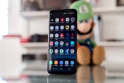
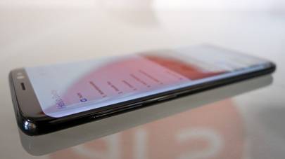
The S8 is hard to resist once you see it in the flesh. Gone are the chunky top and bottom bezels, oblong home button and gaudy Samsung logo that have defined the Galaxy series since the S3 launched in 2012
The quick settings and notifications window – accessed by swiping down from the top of the phone – is near identical to stock Android, bar a change in colour scheme to electric blue
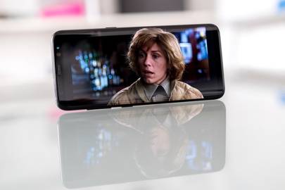
In theory, the 18.5:9 screen should display more content, particularly as Android is so heavily designed around lists in a portrait orientation. In practice, text often wraps onto an extra line compared to a standard 16:9 screen, negating the difference
The iris scanner, the heart-rate monitor and Bixby in its current state exemplifies what’s wrong with Samsung’s approach to mobile. It’s the endless array of features, useful or not, that Samsung throws at its phones. It’s the hope that simply doing more makes the S8 better than the competition. It doesn’t
[Source:- Wired]


