Taipei Base Design Center are an award winning design company that was established in 2002 at Taipei City, Taiwan. The services they provided are interior design, architecture design, media and visual design, restaurant management. They have won Red Dot Design Award, IDEA (International Design Excellence Awards), G-Mark (Good Design Award) and iF Design Award (International Forum Design award).


When the client bought the flat, she discussed with the construction company and changed the layout, the interior of bathroom, equipment of kitchen and the material of the floor. However, after the survey by TBDC and several times discussion with the client, we figured it out, that there were still a lot of differences between the current situation and user’s requirement and lifestyle. Therefore the main point of this design project was to balance these two parts, make maximum use of the current situation to satisfy the user and the resource and spend the budget in most efficient way.


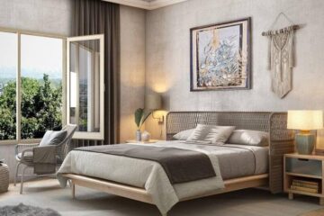
First of all, we made a small modification of the layout. We combined the master’s bedroom and the open space of dressing area used the bulkhead with storage space and video/sound equipment to separate these two areas, but it doesn’t look like both are isolated. Besides, we also integrated the headboard, makeup desk and the entrance of bathroom by decorated wooden veneer board correctly according to their different functions and current conditions. In this way, we got the balance of features and visual effect and avoided the Feng Shui problem that the entrance of bathroom fronted the side of the bed.

Then we had to deal with the space of the kitchen and its equipment. We tore part of original cubicle partition of kitchen down, extended the line of a counter to a dining area, and used the material and the height to separate each other, so the original closed kitchen became open, but still has the flexibility to close it anytime.


We also decreased the budget of carpentry work as much as possible. We moved air conditional, illumination equipment, and curtains to the same area, so the ceiling looks cleaner and simpler than before. We used a large number of system cabinets and combined less carpentry work for the wall and storage spaces. Besides, we also kept the main part of an original wooden floor, added only part of other material of floor to separate different areas and make different atmospheres of spaces. By specific calculation, we decreased the amount of carpentry work to lower the budget and spent this money in other more necessary things.


After these, we also changed the amount of illumination. The amount of primary lighting and its way of switch decides the amount of mechanical/electrical construction and the budget of lamps. After accurate control and calculation, the user could have efficient illumination and save energy; meanwhile, space also became safer while moving around and has different atmosphere by proper places of light.


So how did we use the budget we saved? We spent it buying furniture and lamps. We chose the style of furniture and illumination equipment which has the needed function, ordered it by companies or let it customized. Since these are the primary existence of space and the parts user uses mostly, we would like to bring the maximum user convenience and the most comforting feelings. Only when there are limited conditions, design is unlimited. If the designer only removes and abandons things, stuffs the flat with the fashion blindly, or doesn’t use the resources in a scientific way, he or she should be ashamed of himself and this world. To sum up, the aesthetics problem which people cares most nowadays is the simplest part, so it won’t be necessary to describe it anymore.


